Viz Playground - basic data viz with D3
My D3 “therapy”
So, I’ve tried to write that blog post before but it ended up taking so long and I wasn’t satisfied with the content. I think it induced a frustration that is a reflection of my relationship with D3.
I’ve been into data visualisation for years, and D3 being the tool of choice for aesthetic and interactive web visualisations I wanted to add it to my skillset. In programming (as in a lot of fields) it’s rare to feel you mastered a skill, and can move on to the next. And I really feel like D3 is a work in progress, maybe more so because I’ve never had data visualisation as a central part of my job. I don’t remember how my D3 journey started, but I think my first plots where created during hackathons and involved searching for examples online and reproducing them using datasets of interest. I then took a workshop by Cambridge Coding Academy which was really good for learning the basics. Since then I’ve used D3 with the help of other people’s online tutorials. I’ve also mostly tried out tools (Pandas, Bokeh, Seaborn, Leaflet, Folium, QGIS, Altair, Vega…) that can create nice visualisations easily as a way around D3’s steep learning curve. As I’m now freelancing, I figured I could steer my work towards professional data visualisation, which means D3 is now a critical tool to master. Here is real life picture of me going up D3 learning curve:

Because I learned that being lazy is a good trait in a programmer and because I have tons of ideas for projects involving data visualisation that I can’t wait to work on, here’s my plan:
1) Create templates for different D3 plots
2) Use templates in projects
Et voilà! Easy, just two steps… and I’m ready to take over the world! Mwahahaha! *evil hands rub*
Implementation
Idea
Let’s focus on the first step of my plan for now!
I’m thinking of creating code samples as gists/locks[1] that will ultimately be gathered inside a code repository. They’d be named after the visualisation they enable and they’d be well documented so that others can use them, too. Oh, and here I am dreaming of data visualisations:

Action plan
For the sake of lazyness (and time efficiency) I’m not going to reinvent the wheel. (I think that’s also where I’ve had troubles before.) Luckily Patrick, Data Visualization Stockholm co-organiser, mentioned Block builder which let’s you create a new Block or search other people’s Blocks and fork them as a gist and modify them.
Block builder
Block builder is an amazing platform to work on a (data visualisation) project. You can edit your files and see the output update in a panel above or on the side of the data edition section.
Here’s a screenshot:
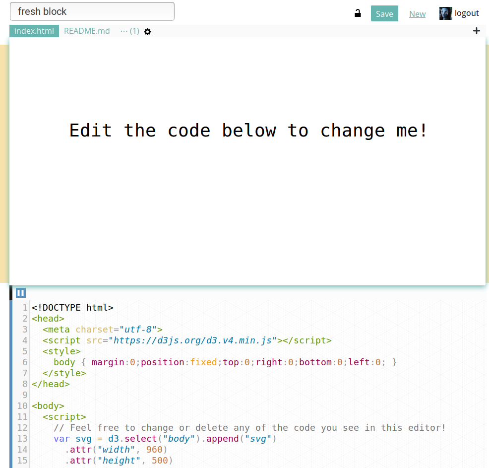
You can search for other’s Blocks which I did. I searched for a “bar chart” done by “mbostock” because Mike Bostock is D3’s creator and I assume his code to follow the best practices. Here’s a link to the Block I wished to reuse. On the Block builder platform, if/once you’re logged in to your Github account, you can just fork the project and a forked Block will be opened in a Block editor. Behind the scene (because you gave the app access to your Github account) it also creates a new gist, and each time you save the project in Block builder this gist is updated.
My bar chart template
There are very little changes to my block compared to the original one. I just expect to work mostly from CSV files, so I created a test data CSV and use the D3 function d3.csv to load the data.
I’m reusing most of the code as I’m still creating rectangular bars.
I changed the colours, removed the “%” on the y axis in the html file and edited the Readme for it to be informative as to what I did, what’s the aim and how the template can be used.
Because I intend to use this project as a template I added a section at the top of the html file with variables which values might need to be updated when creating a new project:
// *** EDIT TO CUSTOMISE ***
var dataFile = "test-data.csv",
    xName = "year", // column name for x-axis in the csv
    xAxisLabel = "Years",
    xLabelxPosition = 50, xLabelyPosition = 80,
    yName = "value", // column name for y-axis in the csv
    yAxisLabel = "Value";

function transformXdata(data) {
  return data;
}
function transformYdata(data) {
  return +data; // '+' converts to numbers
}
// **************************
So this is actually an improved template after a first test. In the section showed above, a new project would include a new CSV file, with different column names for the data to be visualised and different labels for the axes. The label for the x-axis can also easily be adjusted. Something more crucial to the visualisation is the potential need to transform the data that can be done with the two functions transformXdata and transformYdata.
In the case of the test data, the values have to be converted to numbers.
Testing the template
The template is supposed to be as generic as possible and I plan to add to it as I go along. For now let’s see if I can reuse it with a simple dataset of temperatures.
You might neither know nor care, but May 2018 was the warmest May ever recorded in Sweden where I live. I looked up the temperatures for each day of May 2018 on this website [2].
I then created a bar chart of the maximal temperatures (in Celsius degrees) in Stockholm throughout May 2018.
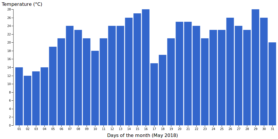 Not bad!
var dataFile = "stockholm_may_temp.csv",
    xName = "day", // column name for x-axis in the csv
    xAxisLabel = "Days of the month (May 2018)",
    xLabelxPosition = 150, xLabelyPosition = 80,
    yName = "maximal", // column name for y-axis in the csv
    yAxisLabel = "Temperature (°C)";

function transformXdata(data) {
  return data.substring(0, 2);
}
function transformYdata(data) {
  return data;
}
I updated the info in the customise section including a transformation of the x-axis data (dates). The full dates had the x-axis all cluttered up so I only kept the day, which is enough to understand the chart.
My take-away
I’m so glad I made my first reusable D3 template! Yay! ^^
However I can already see that the more I add to the template, the harder it’ll be to keep it “generic”. I hope to make well-documented decisions when the time comes :)
Notes
[1] Gists are an easy way to create and share files on Gihub and Bl.ocks are a cool project to visualise code from gists!
Note: Sorry, but I used Block throughout the post as it’s easier to type than Bl.ock.
data source: https://www.accuweather.com/en/se/stockholm/314929/may-weather/314929
[2] One data point seemed really high (40C) so I used the temperature from Dark Sky instead.
Links
-
Basic bar chart template: Block, gist and on Block builder
-
Local data visualisation meetup: Data Visualization Stockholm